Framekit templates
Start from a designer-made template
 Use template
 Use template
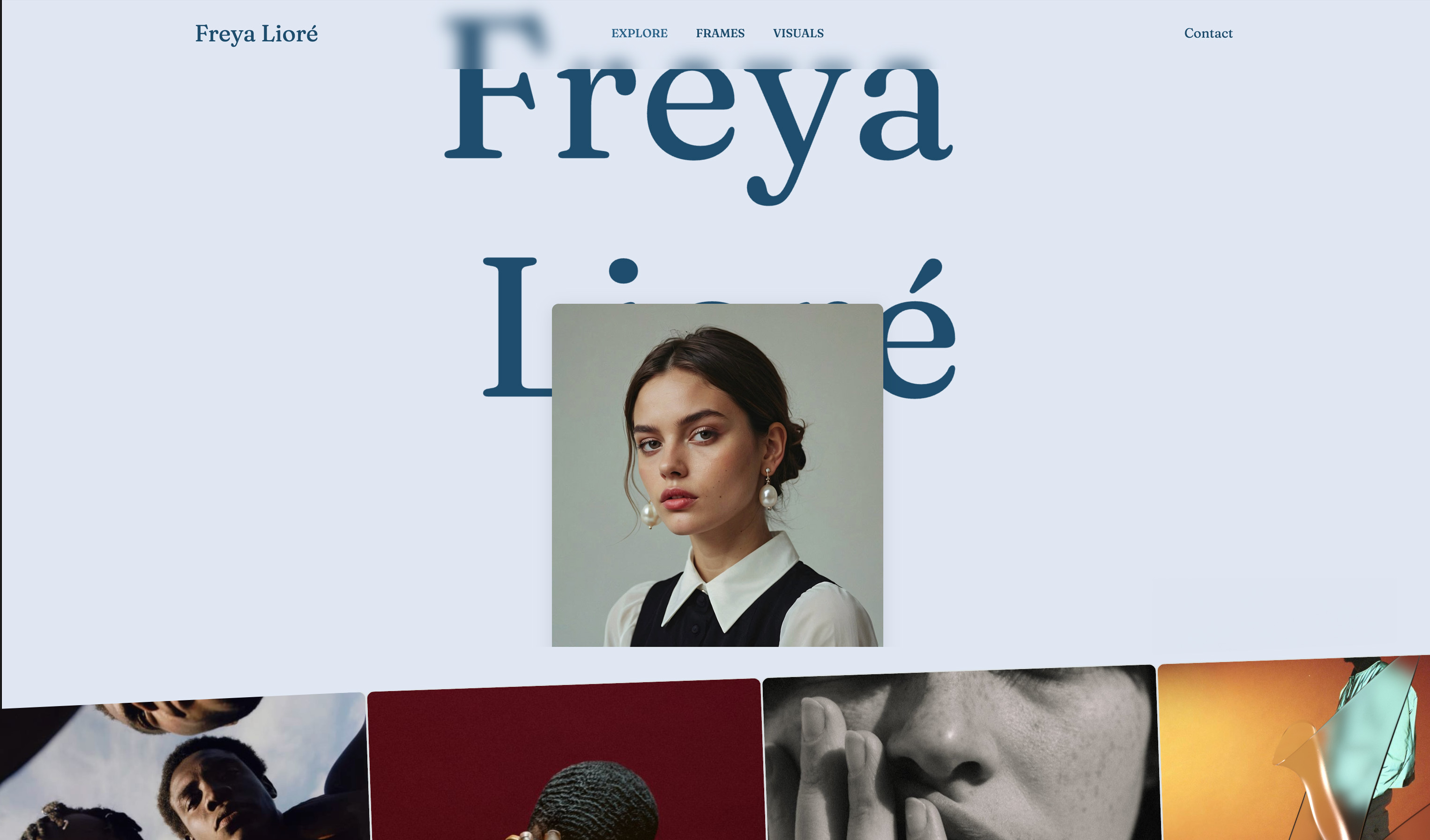 Use template
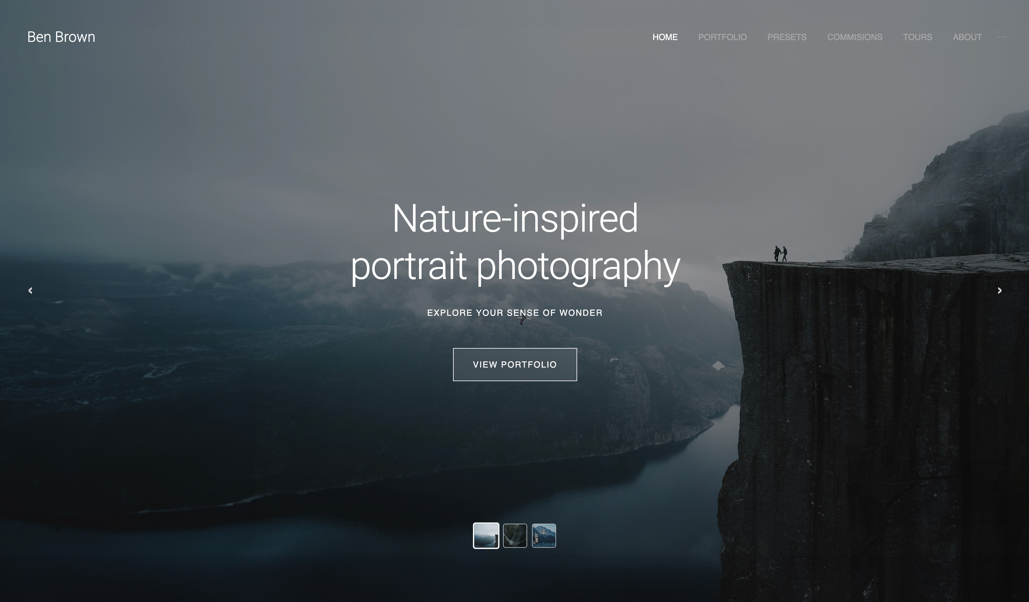 Use template
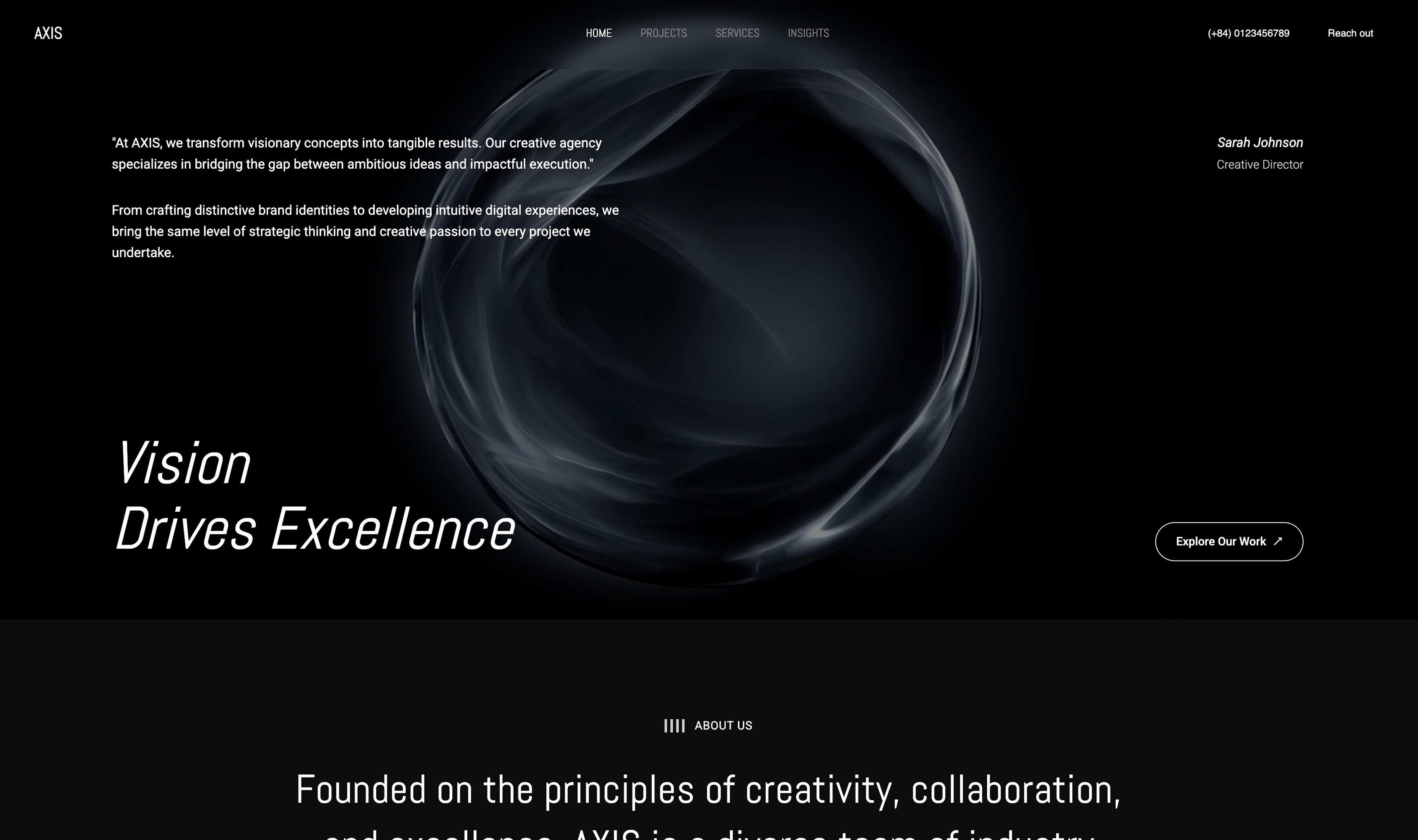 Use template
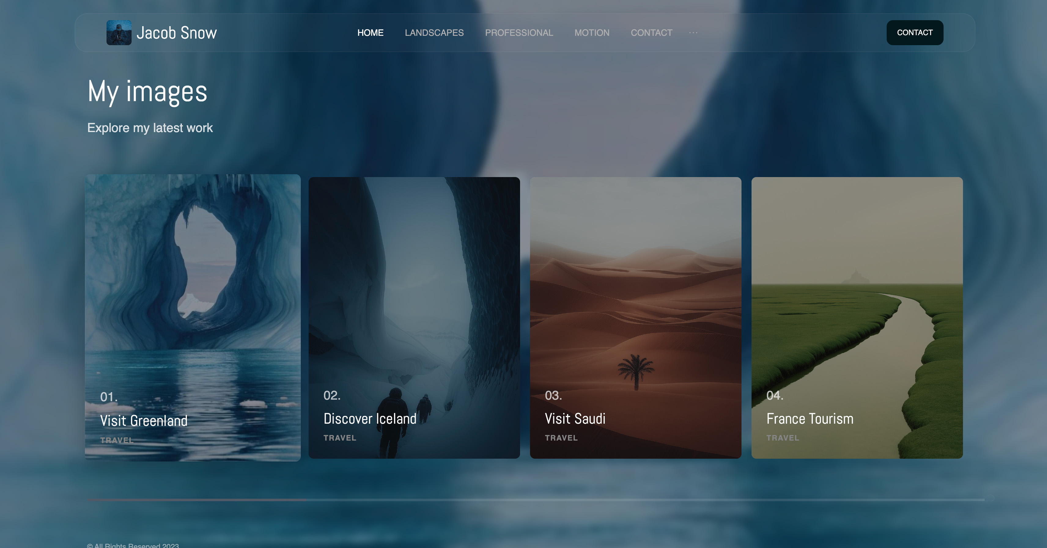 Use template
 Use template
 Use template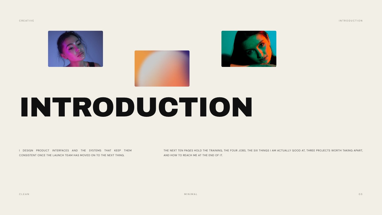
A product designer gets the calendar invite on a Monday: "Portfolio review, 45 minutes, hiring manager plus two designers." Her portfolio site has eleven projects. Her Figma file for the best of them has 340 frames.
Neither is a portfolio presentation, and a portfolio presentation template is what turns them into one before Thursday.
The slot is the constraint that decides everything. Atlassian's published design interview guide gives its portfolio review 45 minutes, split between your presentation and questions from the hiring manager.
GitLab's handbook asks product designers to walk through one case study for about 30 minutes inside a one-hour interview.
Every minute spent scrolling a website or hunting through a design file comes out of the answers the panel is there to hear.
A portfolio presentation is a timed slide deck, usually 15 to 30 slides, in which a designer walks an interview panel through two or three past projects, showing the problem, their own role, the process including what did not work, and the outcome, then takes questions.
A good portfolio presentation template divides a fixed interview slot into four answers per case study (the problem, your role, the process including the messy middle, and the outcome), with two case studies in a 45-minute review and one in a 30-minute walkthrough, because that is what the hiring guides GitLab and Atlassian publish say they evaluate.
Build it in Framekit Slides if you want designed portfolio templates (the full library starts on Starter, $7 a month billed yearly) with speaker notes, a share link and a PDF backup on every plan; use Figma Slides if your case study depends on a live, clickable prototype; use Keynote when you want to present from a desktop app on a Mac with no connection needed; and use Google Slides when the panel wants an editable file in their own workspace.
Full disclosure: Framekit is our product and appears first in the tools section below, for one job: a designed portfolio deck you can present, share as a link and export as a PDF from one place. We have not used the other tools for this comparison; we read their pricing pages and documentation in September 2026 and link each one. Figma Slides embeds live Figma prototypes and Pitch's paid links track visits, slide views and time on each slide, and Framekit does neither.
Where This Template Comes From
Rather than inventing a structure, this template is built backwards from what companies publish about their own design interviews, then checked against the arithmetic of a real slot, so each part of it has a source you can open or a sum you can redo.
Read at the source. The formats and scoring come from three public hiring pages: the GitLab handbook's Product Designer job description, which lays out every interview stage with its length, Atlassian's Design Interview Guide, and Meta's initial interview preparation page for product designers.
Two Nielsen Norman Group articles supply the portfolio-format advice: Rachel Krause's five steps to a UX-design portfolio and Evan Sunwall's guide to applying for and securing a UX job.
Tool prices come from each vendor's own pricing page, read on 19 September 2026.
Calculated. The timing budgets for 30, 45 and 60-minute slots, the slide counts and the year-one tool costs are our arithmetic, shown in the tables so you can change the inputs.
Rendered. The Framekit templates named below were rendered slide by slide from the product itself, and the example copy quoted from them is the copy the templates ship with.
Reported by users. Excluded. Forum threads about portfolio reviews are full of confident timings from single interviews, and none of it could be checked, so none of it is used.
The carried example. A mid-level product designer with a 45-minute portfolio review, presenting two case studies: a booking flow rebuilt over eleven weeks by two designers and one engineer, and an identity delivered together with a 64-component library.
Both are the sample case studies in Framekit's Product Designer Portfolio template, which makes them easy to picture and easy to replace with your own.
Portfolio Reviews by the Numbers
These are the figures that set the shape of the template, each taken from a hiring page or article linked above, so that the time budget and slide count further down rest on something firmer than habit.
- 45 minutes is the length of Atlassian's portfolio review, split into your presentation and then Q&A led by the hiring manager. Meta's initial product design interview is also a 45-minute conversation.
- About 30 minutes is how long GitLab asks a product designer to spend walking through one case study inside a one-hour interview with a designer.
- 3 to 4 years is how recent Atlassian prefers the projects you show to be.
- 60 minutes, two interviewers is Atlassian's follow-up round, in which they question you on the presentation you gave.
- 2 formats NN/g recommends keeping in step: a master deck or PDF holding every project, from which you hide what a given job does not need, and a presentation built from your best case study rather than a scroll through your website.
- 1 warning, given twice: GitLab says a formal presentation is not required but recommends against sharing entire design files, and Atlassian likewise advises against jumping between old PDFs or sharing entire Figma files.
What the Panel Is Actually Scoring
In one lineacross GitLab, Atlassian and the hiring managers Nielsen Norman Group quotes, the list of what a portfolio presentation is judged on is short and consistent, and a template that does not force you to answer every item will quietly leave points on the table.
The table lines up what each source asks for. The overlap is the template: every row that appears in two or three columns needs a slide, or at least a sentence, in every case study you present.
| What they want to see | GitLab (case study walkthrough) | Atlassian (portfolio review) | NN/g hiring managers | Where it goes in the template |
|---|---|---|---|---|
| The problem, user and business | Clearly outlined user and business problems and how you learned about them | The core problems you were solving | "Tell me the problem you were trying to solve" | Case study slide 1 |
| Your role | What your role was, who you worked with, your responsibility | Be upfront about your specific contributions | "your role" | Case study slide 2 |
| Constraints and team | Size and structure of the team, design standards you worked within | Time management, collaboration | "any constraints, project timeline" | Case study slide 2 |
| Process, including dead ends | Sketches, wireframes, prototypes, ideas that did not make it | Your approach | "the messy process" and iteration | Case study slides 3 to 5 |
| Research | How you approached and synthesized research | Not singled out | "how the research informed the design" | Case study slide 3 |
| Craft | Low and high-fidelity work | Craft skills for the role you are interviewing for; typography, text per page, image framing | Polished final design | Case study slide 6 and the deck itself |
| Outcome | Learnings, goals achieved, impact on key metrics | Success metrics and learnings | Real value for users and the organization | Case study slide 7 |
Two things fall out of it. First, the deck is itself a craft sample. Atlassian says so outright: the design of the portfolio matters, down to typography, the amount of text on each page and how images are framed. A cluttered deck argues against you before you speak.
Second, "your role" is the row candidates skip most readily, because saying "I did the flows, Priya did the visual design" feels like giving credit away.
Atlassian writes that it understands most projects are collaborations and asks you to be upfront about your part. A panel that cannot tell what you did will assume the least flattering version.
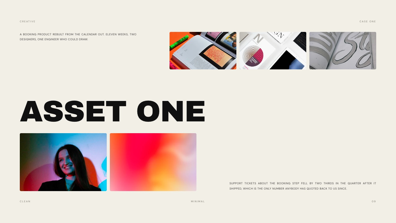
Eleven weeks, two designers, one engineer who could draw', with the outcome line about support tickets at the bottom
The Timing Budget for 30, 45 and 60 Minutes
In one linethe slot length decides how many case studies you can show, and the arithmetic says one case study in 30 minutes, two in 45 and at most three in 60, each with about twelve to sixteen minutes of talking and room left for questions.
Candidates overrun because they plan in slides rather than minutes. The budget below plans in minutes first and derives slides from them, using a planning ratio of roughly one slide per 60 to 90 seconds.
That ratio is a rule of thumb for pacing, not a published standard, and dense process slides will take longer than full-bleed images.
| Block | 30-minute walkthrough (GitLab style) | 45-minute review (Atlassian, Meta) | 60-minute review |
|---|---|---|---|
| Introduction: who you are, what you will show | 2 min | 3 min | 3 min |
| Case study one | 22 min | 14 min | 16 min |
| Case study two | None | 14 min | 16 min |
| Case study three (short) | None | None | 10 min |
| Close: what you want to do next | 1 min | 2 min | 2 min |
| Talking time | 25 min | 33 min | 47 min |
| Left for questions | 5 min | 12 min | 13 min |
| Slides to plan (at 60 to 90 seconds each) | 17 to 25 | 22 to 33 | 31 to 47 |
For the carried example, the 45-minute column means the booking-flow case study gets fourteen minutes and the design system gets fourteen. The twelve minutes of questions are not slack.
At Atlassian the Q&A is one of the two named parts of the review, and its follow-up round exists to dig into what you presented, so a presentation that runs to minute 44 has not saved time, it has deleted the part of the interview where you get to show judgment.
The GitLab column is different in kind. There the case study is 30 minutes of a one-hour interview that also includes situational questions, so the walkthrough is closer to a conversation with a deck than a speech. Plan fewer slides and more pauses.
The rehearsal testpresent the whole deck once with a timer, out loud, and write the elapsed time on the first slide of each case study in your speaker notes. If case study one ends after minute 18 in a 45-minute slot, cut a process slide rather than talking faster.
The Slide-by-Slide Portfolio Presentation Template
The template below is the 45-minute version, 23 slides in all, with each case study built from the same seven beats so the panel learns the rhythm after the first one and can spend its attention on your decisions instead of on finding its place.
| # | Slide | What it says | Time |
|---|---|---|---|
| 1 | Title | Your name, the role you are interviewing for, the date | 15 sec |
| 2 | Who I am | One sentence on what you design, one on where you have done it | 1 min |
| 3 | What you will see | The two case studies in one line each, and why you chose them for this role | 1 min |
| 4 | Agenda and timing | "Two projects, about fourteen minutes each, then your questions" | 30 sec |
| 5 | Case one: the problem | User problem, business problem, how you found out | 2 min |
| 6 | Case one: my role and the team | Your responsibility, who else was on it, the constraints and timeline | 1.5 min |
| 7 | Case one: what we learned | The research or evidence that changed the direction | 2 min |
| 8 | Case one: the messy middle | Two or three routes you tried, with the one you dropped and why | 3 min |
| 9 | Case one: the decision | The moment the direction was settled, and the trade-off you accepted | 2 min |
| 10 | Case one: the craft | Final screens or artifacts, large, with little text | 2 min |
| 11 | Case one: the outcome | The metric, the learning, and what you would do differently | 1.5 min |
| 12 | Divider | The second project's name and a one-line setup | 15 sec |
| 13 to 19 | Case two, same seven beats | Problem, role, evidence, messy middle, decision, craft, outcome | 14 min |
| 20 | What ties them together | The through-line: how you work, in one or two sentences | 1 min |
| 21 | What I want to do next | Why this team, this product, this role | 1 min |
| 22 | Thank you and contact | Name, portfolio link, email | 15 sec |
| 23 | Backup | Extra screens, a third project summary, the answer to the question you expect | Only if asked |
The times add up to roughly 33 minutes, which is the talking budget for a 45-minute slot. For a 30-minute walkthrough, drop case two and slide 20, and give case one's beats more room.
For a 60-minute review, add a short third case study built from four beats (problem, role, decision, outcome) and skip its messy middle.
Slides 1 to 4: the opening minute and a half
The opening is where candidates lose the most time for the least return. A two-minute life story before the first project costs you two minutes of the case study the panel actually came for. One sentence of who you are and one of why these projects will do.
Framekit's Product Designer Portfolio template handles this in its Introduction slide with a line worth borrowing for its economy: the next ten pages hold the training, the four jobs, the six things the designer is actually good at, and three projects worth taking apart.
That is a table of contents and a statement of confidence in one sentence.
Slide 4, the agenda with times on it, looks optional and is not. It tells the panel you have planned the slot, and it gives the hiring manager permission to hold their questions to the end, or to interrupt knowing where you are.
Slides 5 to 11: the seven beats of a case study
The seven beats follow the rows in the scoring table, in the order the panel will want them answered. The problem comes first because nothing else makes sense without it; your role comes second because every later slide is read through it.
For the carried example's booking-flow project, the beats might read like this:
- Problem: people abandoning the booking step and filing support tickets about it; the business problem was the support cost and lost bookings.
- Role and team: "I led the interaction design; a second designer owned visual design; one engineer who could draw joined us for all eleven weeks."
- Evidence: what the support tickets and session recordings showed about where people gave up.
- Messy middle: the two alternatives tried and dropped, shown as rough frames, with one sentence each on why they failed.
- Decision: rebuilding the flow "from the calendar out", and what that cost in scope.
- Craft: four final screens, full size, one idea per slide.
- Outcome: the template's sample line is that support tickets about the booking step fell by two thirds in the quarter after it shipped. Use your own measured number, and say how it was measured.
The messy middle is the beat that separates a portfolio presentation from a portfolio website.
A hiring manager quoted by Nielsen Norman Group wanted to see "the messy process and all the work and research" behind the polished design, and GitLab explicitly invites sketches, wireframes and ideas that did not make it.
Websites tend to hide this; presentations are where it belongs.

Slides 20 to 23: close on judgment, not on thanks
Slide 20 is the one most templates leave out. After two case studies the panel has seen two stories; one or two sentences on what they have in common ("in both, I moved the argument from screens to evidence before the first review") turns them into a description of how you work.
Slide 21 answers the question every panel will ask anyway: why this role. A sentence tied to the company's product is enough.
Slide 23, the backup, holds the material you cut for time, so that when someone asks "did you consider a native app?" you can show the frame rather than describe it.
In one linea template with the same seven beats in every case study gives the panel a rhythm to follow, and the two slides candidates usually skip, the messy middle and the through-line, are the ones that show judgment rather than output.
Building Case Studies That Survive Questions
In one linethe panel's questions will land on the claims in your case study that you cannot back up, so build each case study so that every number has a source, every decision has a rejected alternative, and every screen is yours.
Atlassian describes its individual-contributor portfolio reviews as a deep dive into the details of the choices you made, and its follow-up round is an hour of two interviewers questioning your presentation. Plan for that by preparing the answers before the slides.
| Claim on your slide | The question it invites | What to have ready |
|---|---|---|
| "Tickets fell by two thirds" | Measured how, over what period, against what baseline? | The data source and dates, in your speaker notes |
| "Three concepts went to user sessions" | With whom, how many people, what did you change after? | Session count and the one finding that changed the design |
| "I led the redesign" | What did the other designer do? | A one-sentence split of responsibilities |
| "The client loved it" | What did they push back on? | The one piece of feedback you disagreed with, and what happened |
| "Shipped on time" | What did you cut to get there? | The scope you traded, and whether you would trade it again |
| A polished final screen | What did version one look like? | A rough early frame in the backup slide |
Two habits help. Put the evidence for every number in the speaker notes of that slide, so it is in front of you and not on the screen. And practice once with a friend whose only job is to ask "how do you know?" after every claim.
Choosing which projects to present is the other half. Atlassian prefers work from the past three to four years and asks you to show craft in the specific discipline you are interviewing for.
NN/g's advice to keep a master deck and hide projects per application means you should never be rebuilding the whole deck for each interview, only choosing which two case studies to unhide.
Our guide to case study templates for designers goes deeper on writing the case studies themselves.
Remote or in the Room: What Changes
In one linein a remote interview the panel sees your deck at whatever size their video window allows and you depend on a screen share, so type size, presenter notes on a second screen and a PDF backup matter more than any animation.
Most of the template is identical in both settings. What changes is the machinery around it, and the machinery is where interviews go wrong in the first five minutes.
| Concern | Remote (video call) | In person |
|---|---|---|
| Who sees what | The panel sees your shared window, often scaled down | The panel sees a projector or a TV, often at an angle |
| Minimum type size | Larger than you think; body text that reads on your monitor may not survive a shrunken video tile | Readable from the back of the room |
| Presenter notes | On a second screen or a separate presenter window | On your laptop, facing you |
| Clickable prototypes | Share the prototype window when you reach it, then return to slides | Same, but check the room's display first |
| Backup | A PDF on your desktop and a share link ready to paste in the chat | A PDF on a USB stick or in your email |
| Failure you should rehearse | Screen share picking the wrong window | Laptop not connecting to the room's display |
Apple's Keynote documentation describes keeping presenter notes and controls in a separate window on a Mac during a video call, which is the setup worth copying whatever tool you use: notes visible to you, slides only to them.
Nielsen Norman Group's Evan Sunwall makes the related point that presenting a case study as a structured presentation, rather than scrolling a portfolio page, reads as more professional.
The backup deserves one more line. Every tool here can fail on the day, from a browser tab that will not share to a desktop app that will not open a file. A PDF export of the same deck, already open in a second window, turns a technical failure into a ten-second pause.
Six Tools to Present a Portfolio From
The six tools below cover almost every way designers present portfolios in interviews, and each wins for a different reason: designed templates, live prototypes, a steady desktop app, a file the panel can edit, view tracking or the largest template library.
| Tool | Price to start | Portfolio templates | Presenter notes | Live prototype on a slide | Share link | PDF backup |
|---|---|---|---|---|---|---|
| Framekit Slides | Free; full library from $7 a month billed yearly | Product Designer, Photographer and Stylist, Director and DP, Creative Studio portfolios | Yes, every slide | No (YouTube and Vimeo embeds only) | Yes, no password, total view count only | Yes, every plan |
| Figma Slides | Collab seat $3 a month as listed | Community and Figma templates | Yes | Yes, live Figma prototypes | Yes | Yes |
| Keynote | Free on Apple devices; Creator Studio $12.99 a month for premium themes | Apple themes, plus premium themes with a subscription | Yes, separate presenter window | No | Via iCloud | Yes |
| Google Slides | Free with a Google account | Basic themes | Yes | No | Yes, with permissions | Yes |
| Pitch | Free; Plus EUR 10 a month paying yearly | Pitch templates | Yes | No | Yes; tracking on Team and up | Yes |
| Canva | Free; Pro EUR 110 a year | Large library of portfolio designs | Yes | No | Yes | Yes |
Read the "live prototype" column first if your best case study is an interaction you need to click through. Only Figma Slides puts a working Figma prototype inside a slide; with every other tool you switch windows at that point, which is fine if you rehearse the switch.
1. Framekit Slides: Best for a Designed Portfolio Deck on Every Plan
Framekit is an AI website builder for designers, photographers and filmmakers, and Slides is the part of it built for decks like this one, with portfolio templates made to look like finished editorial work rather than a corporate theme with your screenshots dropped in.
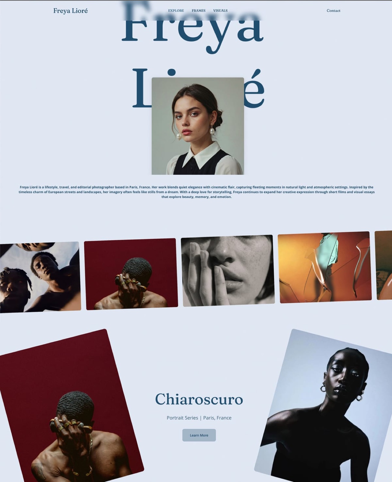
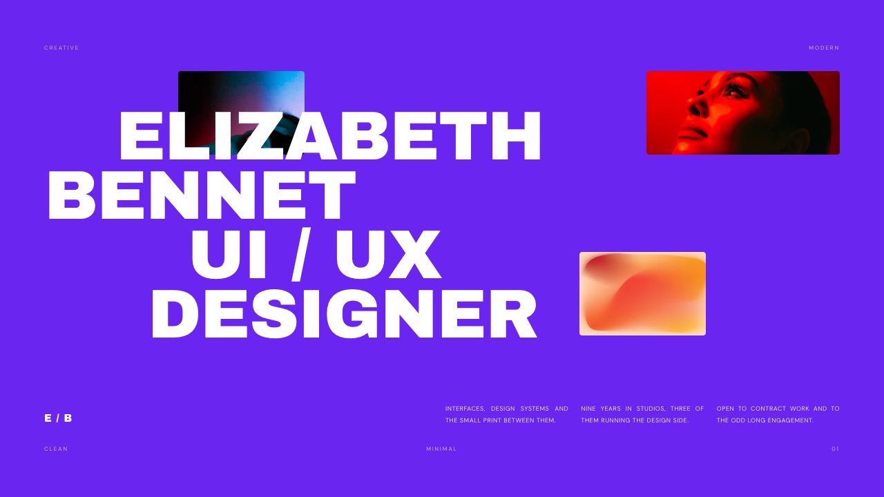
The template that matches this article is the Product Designer Portfolio: 12 slides (Cover, a paper-textured second cover, Introduction, The name page, Education, Experience, Skills, Portfolio, Asset one, Asset two, Asset three and Thank you).
The three Asset slides are case study openers, each with a one-line setup, image slots and an outcome line, which maps directly onto the seven beats above if you add slides between them.
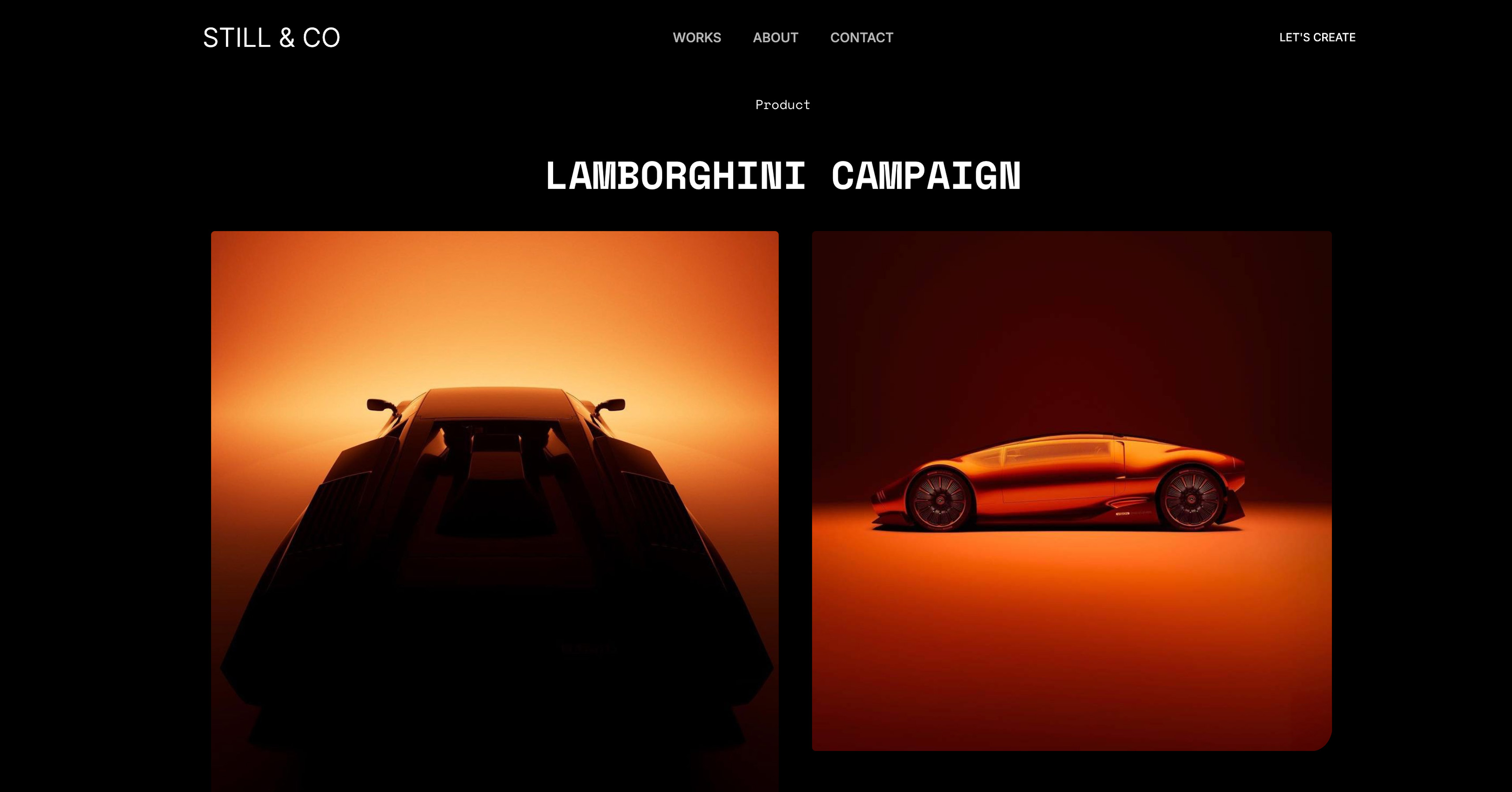
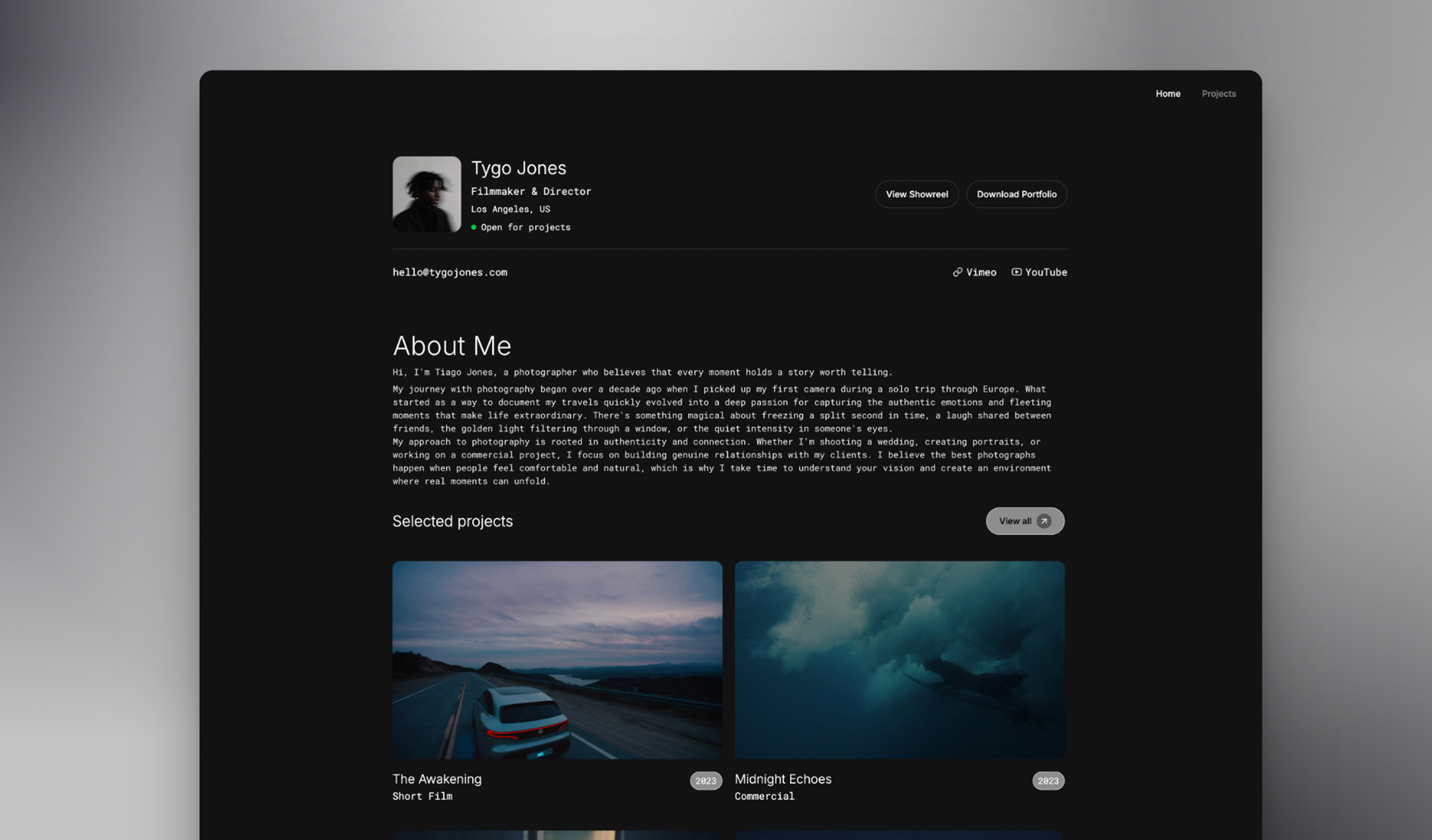
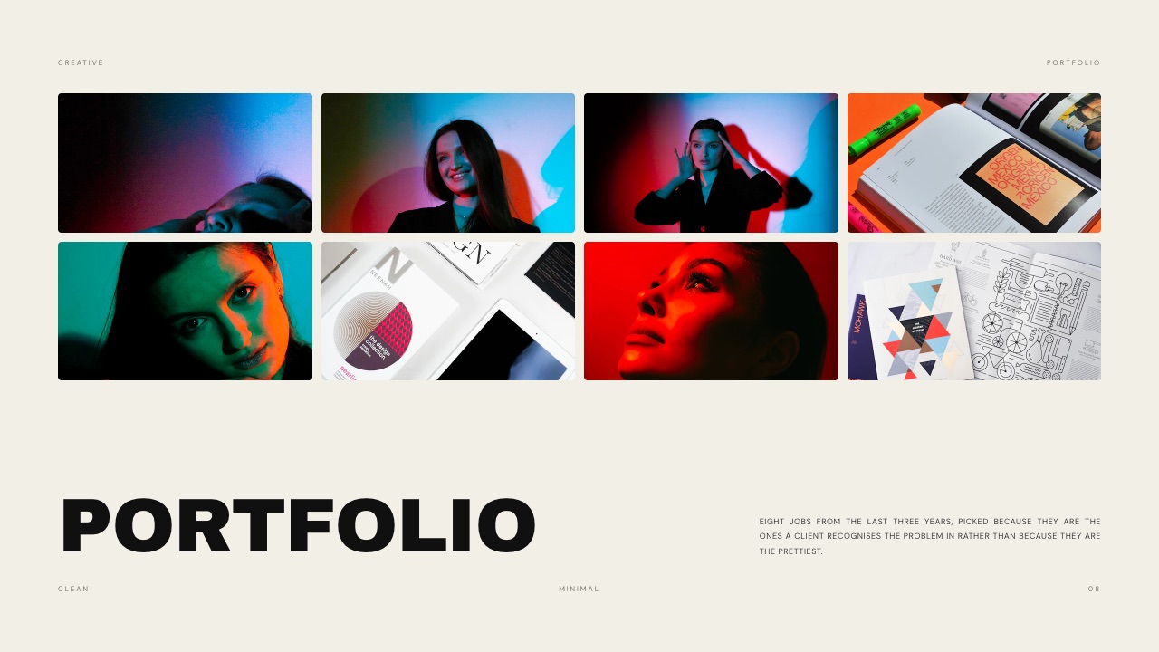
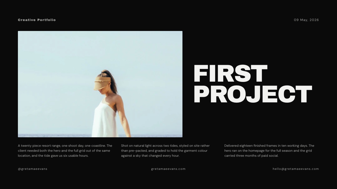
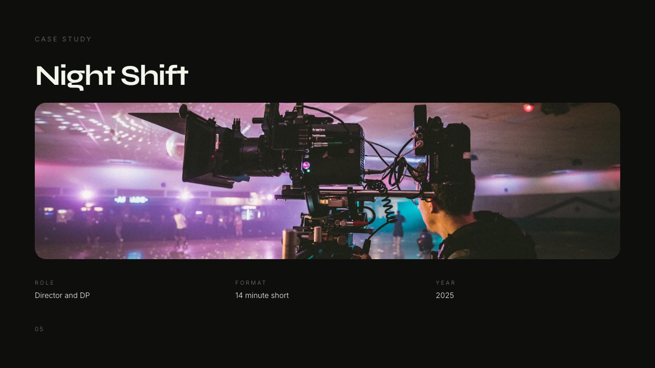
For photographers, stylists and filmmakers, the Photographer and Stylist Portfolio (10 slides), the Director and DP Portfolio (20 slides) and the Creative Studio Portfolio (12 slides) follow the same idea for their disciplines.
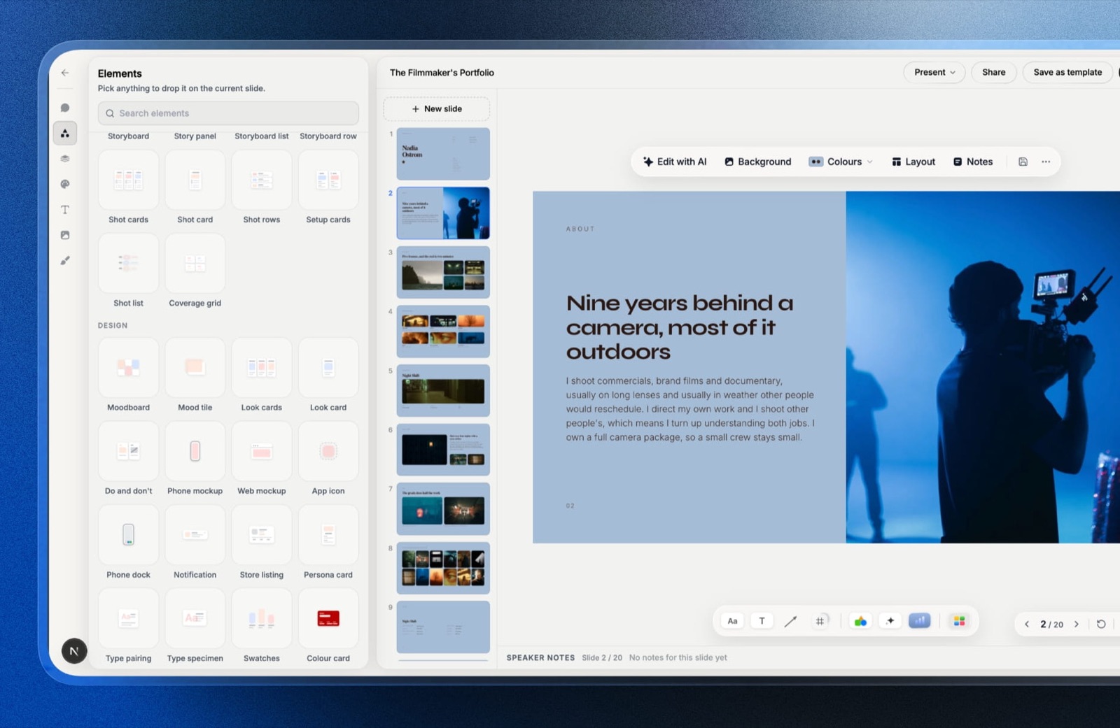
What every plan getsunlimited decks, the AI slide writer (describe a slide and it writes and lays it out), speaker notes on every slide, full-screen presenting from Framekit, a share link and PDF export, plus your own fonts and colors across the deck.
That covers the presenter-notes-plus-PDF-backup setup this article recommends without paying anything.
The real numberthe full template library, including the Product Designer Portfolio, your own uploaded fonts and removing the Framekit byline start on Starter at $7 a month billed yearly ($84 a year) or $9 month to month.
The same plan puts your portfolio website on your own domain, so the link on slide 22 goes somewhere that matches the deck.
The standout detailthe deck and your portfolio site live on one account, so the case study you present and the case study page the panel opens afterward can share images, type and color without being rebuilt twice.
The gotchayou cannot put a clickable Figma prototype inside a Framekit slide; video embeds are YouTube and Vimeo. Share links have no password and report only a total view count, not who opened the deck.
PowerPoint export (Pro and up) turns each slide into a picture, so a recruiter who asks for an editable .pptx will get images, not text boxes.
Skip it ifyour strongest case study only makes sense as a live prototype, or the company asks you to submit an editable PowerPoint or Google Slides file.
Verdict: the best choice for designers who want the deck itself to prove their craft, with notes and a PDF backup on the free plan, and the wrong tool for a presentation that lives or dies on an embedded prototype.
2. Figma Slides: Best When the Prototype Is the Case Study
Figma Slides is the presentation tool inside Figma, and for product and UX designers its advantage is decisive in one situation: you can put a live Figma Design prototype on a slide and click through it without leaving the deck.
Figma's pricing page lists the Professional plan's Collab seat at $3 a month and states that it includes full access to FigJam, Figma Slides and Figma Buzz, while a Full seat, which adds Figma Design, is $16 a month as listed.
Slides also offers live polls, alignment scales and voting, which suits a design review more than an interview but shows how the tool is meant to be used.
The real numberfor a designer who already pays for a Full seat, Slides costs nothing extra. For one who only wants to present, the Collab seat is $36 a year at the listed monthly price.
The standout detailyour case study frames and your slides can come from the same files, so a change to a screen does not mean re-exporting it into a presentation tool.
The gotchaa deck that depends on a live prototype depends on the prototype loading during a screen share. Rehearse the click-through on the connection you will interview on, and keep a recorded walkthrough as a backup.
Skip it ifyou are a graphic designer, photographer or illustrator with no interactive work; the prototype advantage does not apply to you.
Verdict: the right pick for product designers whose best evidence is an interaction, and an unnecessary one for everyone else. Designers weighing other options can compare Figma Slides alternatives.
3. Keynote: Best for Presenting From a Mac Without Surprises
Keynote is Apple's presentation app, and its case for interviews is simple: it runs locally on a Mac, so a flaky connection cannot take the deck down, and it has a presenter setup built for exactly the remote-interview problem described above.
Apple's support pages describe keeping presenter notes and controls in a separate window on your Mac while presenting in a video conferencing app, and Keynote for iCloud lets you edit and present in a browser on a Mac or Windows computer.
According to Apple's Creator Studio support page, Keynote comes with every new iPhone, Mac and iPad, and a Creator Studio subscription unlocks premium content and intelligent features.
The real numberApple Creator Studio launched in January 2026 at $12.99 a month or $129 a year, per Apple's announcement, and it bundles premium Keynote themes with apps such as Final Cut Pro and Logic Pro.
You do not need it to build and present a portfolio deck.
The gotchathe Keynote file lives on your Mac. If the panel asks for the deck afterward, you are exporting a PDF or a PowerPoint file, and the version they receive is a copy that will not update.
Skip it ifyou work on Windows, or your interviews always ask for a link rather than a file.
Verdict: the steadiest choice for Mac users who present from their own machine. Our list of Keynote alternatives covers the cross-platform options.
4. Google Slides: Best When the Panel Wants a File They Can Open
Google Slides is the plainest tool here and sometimes the most practical, because many companies run on Google Workspace and a Slides link opens for every interviewer without an account, an app or a download.
Google's product page says Slides can import PowerPoint and Canva presentations and edit PowerPoint files directly, which matters when a take-home exercise arrives as a .pptx. It is included with a free Google account.
The standout detailpermissions. You can share view-only with the panel before the interview, so they can skim the deck in advance, and switch to comment access if they want to leave notes.
The gotchaits themes are generic, and a design portfolio in a default theme argues against the craft you are trying to show. Budget time to set your own type scale and grid.
Skip it ifthe visual quality of the deck is part of what you are being judged on and you do not want to build a design system inside a basic editor.
Verdict: the dependable fallback and the right format when a company asks for an editable file. See Google Slides alternatives if the defaults frustrate you.
5. Pitch: Best if You Want to Know When the Deck Was Opened
Pitch is a collaborative presentation tool, and its distinctive feature for job hunting is tracking: on paid team plans, links can report visits, slide views and time spent on each slide.
Pitch's pricing page, as served to us in euros in September 2026, shows a free plan with unlimited presentations and 100 AI credits that do not renew, Plus at EUR 10 a month paying yearly with custom fonts, video uploads and PowerPoint exports, and Team at EUR 15 a month paying yearly with 25 advanced links that track visits, slide views and time on slide.
The standout detailif you send the deck ahead of an interview, a tracked link tells you whether anyone opened it and which case study they lingered on, which is useful for deciding what to lead with.
The gotchathe tracking sits on Team and up, not on the individual Plus plan, so the feature that makes Pitch different is the one a solo job seeker pays most for.
Verdict: a polished all-rounder and the only tool here that tells you what happened after you sent the link, at a price that makes sense mainly if you are sending many decks. Compare it in Pitch alternatives.
6. Canva: Best for the Widest Choice of Starting Layouts
Canva has the largest template library of any tool here, including many portfolio presentation designs, and for graphic designers early in their careers it is often the fastest way to a clean deck.
Canva lists Pro at EUR 110 a year for one person for European buyers, with more than 3.6 million templates on Pro against 1.6 million on Free. Its pricing page blocks automated readers, so it is not linked here.
The gotchaa popular Canva template is recognizable. In a design interview, a deck the panel has seen three times this month says something about your process you may not intend. Change the grid and type, not just the colors.
Verdict: a fine starting point for a first portfolio presentation and a weak one for a senior design role, where the deck is part of the evidence. Our Pitch vs Canva comparison covers the trade-offs between the two.
What a Year of Presenting Costs
In one linea job search's worth of portfolio presentations can cost nothing in four of the six tools, so the money question is really which paid feature you would use, whether that is a designed template library, live prototypes or view tracking.
Most designers present in bursts: five or six interviews over two months, then nothing for a year or two. That argues for monthly billing on whatever you pay for, and for checking what the free plan already does before paying at all.
| Tool | Free plan covers the whole template? | Cheapest paid option, per year | What paying adds for an interview deck |
|---|---|---|---|
| Framekit Slides | Yes for notes, presenting, link and PDF; not the portfolio templates | $84 (Starter, billed yearly) or $9 for a single month | The Product Designer Portfolio and every other template, your own fonts, no byline, your site on your own domain |
| Figma Slides | Not confirmed from Figma's pricing page | $36 (Collab seat at the listed $3 a month) | Full Slides access, live prototypes |
| Keynote | Yes | $0 needed; Creator Studio $129 if wanted | Premium themes and AI image features |
| Google Slides | Yes | $0 | Nothing you need for this job |
| Pitch | Yes, with basic links | EUR 120 (Plus at EUR 10 a month paying yearly) | Custom fonts, video uploads, PowerPoint export; tracking needs Team |
| Canva | Yes, with the free template set | EUR 110 (Pro) | The larger template library and brand controls |
The cheapest sound setup for a single interview is a free tool plus a PDF backup.
The case for paying is narrower than tool marketing suggests: pay for Figma if a prototype is your evidence, for Framekit Starter if you want a designed portfolio template and a matching site on your own domain, and for Pitch Team only if you are sending decks ahead of many interviews and want to know which ones were read.
Seven Ways Portfolio Presentations Go Wrong
In one linethe common failures are not about design quality but about time and evidence: running over, presenting from the wrong source, hiding your role, and claiming results you cannot explain when someone asks how you measured them.
- Presenting from the website. Nielsen Norman Group advises building a proper presentation from your best case study instead of scrolling a portfolio page. A website is designed to be skimmed alone, not narrated.
- Presenting from the design file. GitLab recommends against sharing entire design files because interviewers struggle to follow along, and Atlassian says much the same about jumping between PDFs and Figma files.
- Three case studies in 45 minutes. The arithmetic above leaves about nine minutes each once questions are protected, which is not enough for a problem, a role, a messy middle and an outcome.
- A biography opener. Two minutes on where you grew up is two minutes out of the case study the panel is scoring.
- "We" all the way through. Atlassian asks you to be upfront about your specific contributions. Say "I" for your decisions and "we" for the team's.
- Outcomes without method. "Conversion went up 40%" invites "how did you measure it?" If the answer is uncertain, say what you observed and how, and leave the headline number out.
- Old work. Atlassian prefers projects from the last three to four years. A strong older project can go in the backup slide for questions.
For the version of this problem that happens with clients rather than hiring panels, our guide on presenting design work to clients covers the review meeting itself.
Which Setup Fits Your Interview
The quickest route to the right template and tool is to answer five questions about the interview in front of you, in this order, and stop at the first answer that settles it, because each one removes options the next would otherwise weigh.
Is your best evidence an interaction the panel needs to click through? If yes, build in Figma Slides and embed the prototype, with a recorded walkthrough as backup. If not, continue.
Has the company asked for an editable file, or said it uses Google Workspace? If yes, build in Google Slides, or build elsewhere and prepare a Slides or PowerPoint version, remembering that Framekit's PowerPoint export is images. If not, continue.
Is the slot 30 minutes for one case study, as in GitLab's format? If yes, use the seven beats for a single project with more time on the messy middle, and keep the deck under 25 slides. If it is 45 minutes, use two case studies; if 60, add a short third.
Do you want the deck to show your design craft as strongly as the work inside it, and to share an account with your portfolio site? If yes, start from Framekit's Product Designer Portfolio template (or the Photographer and Stylist, Director and DP, or Creative Studio portfolio) and present from Framekit with notes on, keeping the PDF export open as backup.
If not, Keynote on a Mac or Canva anywhere will do the job.
Are you sending the deck ahead of many interviews and want to know if it was opened? If yes, Pitch's tracked links on its Team plan are the only option here that tells you. Otherwise, a share link and a PDF are enough.
If you also need the leave-behind version, our guide to making a portfolio PDF covers the file you send after the interview.
Frequently Asked Questions
How long should a portfolio presentation be?
A portfolio presentation should fill about three quarters of the interview slot and leave the rest for questions.
For a 45-minute review, like Atlassian's, plan about 33 minutes of talking and 12 of questions; for GitLab's roughly 30-minute case study walkthrough, plan about 25 minutes.
At 60 to 90 seconds per slide, that is roughly 22 to 33 slides for a 45-minute slot.
How many case studies should I present in a design interview?
A design interview portfolio presentation should usually cover two case studies in 45 minutes and one in a 30-minute walkthrough.
GitLab asks for one case study over about 30 minutes; in a 45-minute review, two case studies at roughly fourteen minutes each leave twelve minutes for questions.
A third project fits only in a 60-minute slot, and then only as a short summary.
What should a portfolio presentation include?
A portfolio presentation should include a short introduction, two or three case studies, and a close on what you want to do next.
Each case study should cover the problem, your role and team, the evidence that shaped the work, the routes you tried and dropped, the key decision, the final craft and the outcome.
GitLab and Atlassian both list these points in their public interview guides.
Should I present my portfolio website or a slide deck in an interview?
A slide deck built from your best case study is usually better than presenting your portfolio website.
Nielsen Norman Group recommends structuring a case study into a proper presentation rather than scrolling a portfolio page, and GitLab advises against sharing entire design files.
Keep the website for the panel to browse afterward, and link it on your final slide.
What do interviewers look for in a UX portfolio presentation?
Interviewers in a UX portfolio presentation look for a clearly defined problem, your specific role, a visible process including the parts that did not work, how research informed decisions, the quality of your craft, and a measurable outcome.
GitLab's handbook lists these explicitly, and Atlassian adds that the design of the presentation itself, from typography to image framing, is part of what it evaluates.
How is a graphic design portfolio presentation different from a UX one?
A graphic design portfolio presentation puts more of its time into the craft slides and less into research and user flows.
The seven beats still apply, but the evidence slide is usually a brief, a brand audit or a competitor review rather than usability research, and the craft beat may take three or four full-bleed slides.
Outcomes are often adoption, launch results or client feedback rather than product metrics.
Is Figma Slides or Keynote better for a portfolio presentation?
Figma Slides is better for a portfolio presentation when your case study depends on a live Figma prototype, because it can embed one inside a slide.
Keynote is better when you present from a Mac and want a desktop app with a separate presenter window during video calls. Keynote is included with Apple devices; Figma lists its Collab seat, which includes Slides, at $3 a month.
Can I use Framekit for a portfolio presentation?
Framekit can be used for a portfolio presentation through Framekit Slides, which includes a 12-slide Product Designer Portfolio template plus photographer, filmmaker and studio portfolio templates.
Every plan includes speaker notes, full-screen presenting, a share link and PDF export; the full template library starts on the Starter plan at $7 a month billed yearly. It cannot embed live Figma prototypes.
Should I send my portfolio presentation before the interview?
Sending a portfolio presentation before the interview helps only if the company asks for it or you want the panel to arrive with questions. Share a view-only link or a PDF, not the working file.
If you need to know whether it was opened, Pitch's tracked links on its Team plan report visits and time per slide; most other tools, including Framekit, show at most a total view count.
What should I do if the screen share fails during my portfolio presentation?
If the screen share fails during a portfolio presentation, switch to a PDF export of the same deck that you already have open, or paste a view-only link into the call chat so the panel can follow along. Rehearse this once beforehand.
A backup that takes ten seconds to reach turns a technical failure into a short pause instead of a lost interview.
Final Verdict
The best portfolio presentation template is a clock divided into answers: a short opening, two case studies of about fourteen minutes each built from the same seven beats, a close on what ties them together, and twelve minutes left for questions in a 45-minute slot.
GitLab and Atlassian publish what they evaluate, and every beat in the template maps to something on their lists.
For the tool, Framekit Slides is our pick for designers who want the deck itself to demonstrate craft, starting from a designed Product Designer Portfolio template with notes, presenting and a PDF backup on every plan.
Where Framekit loses: it cannot embed a live Figma prototype, its PowerPoint export is picture-based, and its share links have no password or per-viewer tracking.
Product designers whose best evidence is an interaction are a better fit for Figma Slides, companies that want an editable file are better served by Google Slides, and anyone who wants to know which case study the panel read before the call should look at Pitch.
Related readingfor the site the panel opens after your presentation, see the best website builders for UX designers and the best website builders for graphic designers; for the written side of each project, see case study templates for designers.
Need the work to show first?
The graphic design portfolio examples break down 12 studios page by page, and the Claude Design alternatives guide compares tools for building the deck itself.